Card
TheCard component is a versatile container for displaying content. Material UI's Card component provides a consistent, accessible, and customizable way to present information in a structured format.
Cards are used to display content and actions about a single topic, such as articles, products, user profiles, or any other grouped information.
Basic Card
A simple card with content:
This is a basic card with content. Cards are useful for displaying information in a structured format.
jsx<Card sx={{ maxWidth: 345 }}><CardContent><Typography gutterBottom variant="h5" component="div">Card Title</Typography><Typography variant="body2" color="text.secondary">This is a basic card with content.</Typography></CardContent></Card>
Card with Media
Cards can include images or other media:
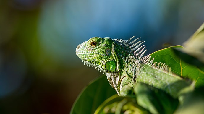
Lizards are a widespread group of squamate reptiles, with over 6,000 species, ranging across all continents except Antarctica.
jsx<Card sx={{ maxWidth: 345 }}><CardMediacomponent="img"height="140"image="/path/to/image.jpg"alt="Image description"/><CardContent><Typography gutterBottom variant="h5" component="div">Card Title</Typography><Typography variant="body2" color="text.secondary">Card description text.</Typography></CardContent></Card>
Card with Actions
Cards can include action buttons:
This card includes action buttons at the bottom.
jsx<Card sx={{ maxWidth: 345 }}><CardContent><Typography variant="h5">Card with Actions</Typography><Typography variant="body2" color="text.secondary">Card content here.</Typography></CardContent><CardActions><Button size="small">Share</Button><Button size="small">Learn More</Button></CardActions></Card>
Card with Header
Cards can include a header with an avatar and action buttons:
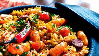
This impressive paella is a perfect party dish and a fun meal to cook together with your guests.
jsx<Card sx={{ maxWidth: 345 }}><CardHeaderavatar={<Avatar sx={{ bgcolor: "primary.main" }}>R</Avatar>}action={<IconButton><MoreVert /></IconButton>}title="Card Title"subheader="Subtitle"/><CardContent><Typography variant="body2" color="text.secondary">Card content here.</Typography></CardContent><CardActions><IconButton><Favorite /></IconButton><IconButton><Share /></IconButton></CardActions></Card>
Complete Card Example
A card with all features combined:
This is a complete card example with header, media, content, and actions.
Elevation
Cards support different elevation levels for depth:
Elevation 0
Elevation 2
Elevation 8
Elevation 24
jsx<Card elevation={0}>No elevation</Card><Card elevation={2}>Low elevation</Card><Card elevation={8}>Medium elevation</Card><Card elevation={24}>High elevation</Card>
Common Props
The Card component and its subcomponents accept various props:
jsx<Cardelevation={1} // number (0-24) - shadow depthraised={false} // boolean - if true, elevation increases on hoversx={{}} // object - custom styles><CardHeaderavatar={<Avatar />} // ReactNodetitle="Title" // string | ReactNodesubheader="Subtitle" // string | ReactNodeaction={<IconButton />} // ReactNodetitleTypographyProps={{}} // objectsubheaderTypographyProps={{}} // object/><CardMediacomponent="img" // 'img' | 'video' | 'iframe' | etc.image="/path/to/image.jpg" // stringheight={140} // number | stringalt="Description" // string/><CardContent>{/* Card content */}</CardContent><CardActionsdisableSpacing={false} // boolean - removes padding between actions>{/* Action buttons */}</CardActions></Card>
Accessibility
Material UI Cards are built with accessibility in mind:
- Semantic HTML: Cards use appropriate semantic elements
- Keyboard navigation: All interactive elements are keyboard accessible
- Screen readers: Proper ARIA labels and roles
- Focus indicators: Clear visual focus indicators for keyboard users
- Alt text: Images in CardMedia should have descriptive alt text
- Color contrast: Meets WCAG guidelines for text contrast
Best Practices
- Use cards for grouped content - Cards work best for related information
- Keep content concise - Cards should contain focused, digestible content
- Provide clear actions - Make action buttons clear and accessible
- Use appropriate elevation - Higher elevation draws more attention
- Include meaningful images - Use relevant, high-quality images in CardMedia
- Maintain consistent sizing - Keep card dimensions consistent within a grid
- Consider responsive design - Ensure cards work well on mobile devices
- Use headers effectively - CardHeader is great for metadata and avatars
Examples
Product Card
jsx<Card sx={{ maxWidth: 345 }}><CardMediacomponent="img"height="200"image="/product-image.jpg"alt="Product name"/><CardContent><Typography gutterBottom variant="h5">Product Name</Typography><Typography variant="h6" color="primary">$99.99</Typography><Typography variant="body2" color="text.secondary">Product description here.</Typography></CardContent><CardActions><Button size="small" variant="contained" fullWidth>Add to Cart</Button></CardActions></Card>
Article Card
jsx<Card><CardHeaderavatar={<Avatar>JD</Avatar>}title="Article Title"subheader="January 1, 2024"/><CardMediacomponent="img"height="194"image="/article-image.jpg"alt="Article"/><CardContent><Typography variant="body2" color="text.secondary">Article excerpt or summary text goes here.</Typography></CardContent><CardActions><Button size="small">Read More</Button><Button size="small">Share</Button></CardActions></Card>
User Profile Card
jsx<Card sx={{ maxWidth: 345 }}><CardContent sx={{ textAlign: "center" }}><Avatarsx={{ width: 80, height: 80, mx: "auto", mb: 2 }}src="/avatar.jpg">JD</Avatar><Typography variant="h5" gutterBottom>John Doe</Typography><Typography variant="body2" color="text.secondary" gutterBottom>Product Designer</Typography><Typography variant="body2" color="text.secondary">San Francisco, CA</Typography></CardContent><CardActions sx={{ justifyContent: "center" }}><Button variant="contained">Follow</Button><Button variant="outlined">Message</Button></CardActions></Card>